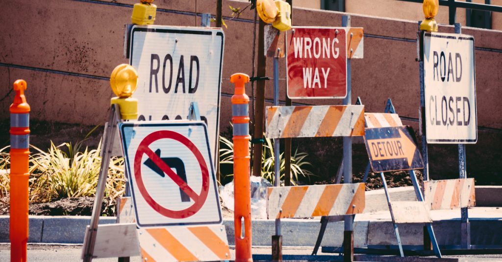
Road signs should convey the maximum amount of information with the minimum amount of content, as it is not possible for drivers to stop their vehicle and carefully read the instructions presented. Therefore, images, typeface, colours and shapes of road signage are designed, or at least should be, in a way that their meaning is immediately understood.
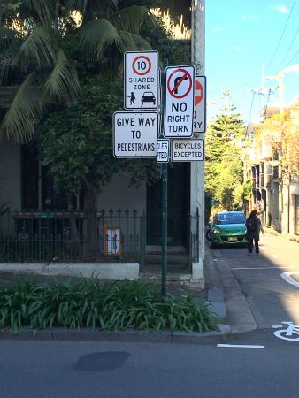
Over time, road conditions change to include shared zones between cars and pedestrians or bike lanes, parking zones are reconfigured, etc. It is not unusual to observe situations where the original signage is not removed and new signs just added over the top and around them, as can be seen in the picture below. In those cases, it is impossible for our brain to process every message whilst driving (even at a slow speed) and to interpret the instructions all at once.

Our brains process images faster than text, which makes sense when you consider that during a vast portion of our existence we relied on non-written communication forms. As mentioned by Marcel Just, director of the Center for Cognitive Brain Imaging at Carnegie Mellon University: “processing print isn’t something the human brain was built for. The printed word is a human artefact. It’s very convenient and it’s worked very well for us for 5,000 years, but it’s an invention of human beings. By contrast Mother Nature has built into our brain our ability to see the visual world and interpret it. Even the spoken language is much more a given biologically than reading written language”.
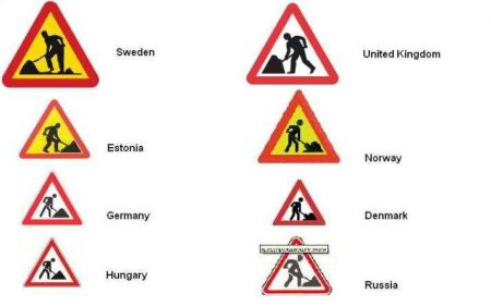
This seems to justify the vast proliferation of the use of iconography in signage and the fact that similar signage is adopted internationally overcomes language barriers for travellers as you can see in the image for roadworks below:

If we expect road users to comply with the directions given, the signage should be clear, easy to read and rely as much as possible on imagery.
Image Credit: ptc. archive and Wayfinding_UK’s Blog.
