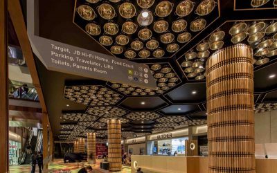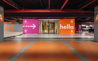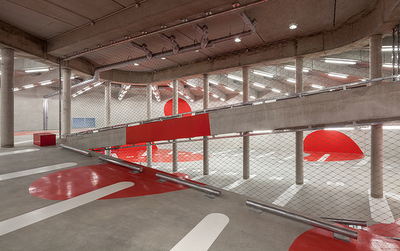
Although the civil design and architecture foundations of a site dictate how people move around at a structural level, the wayfinding system is the communication layer guiding the navigation into and through the built environment. The wayfinding system provides numerous clues for users so that they can easily find what they are looking for. At each touch point, the questions to be asked are: where does this person need to go? What pieces of information does he or she need to get to the next touch point?
With that in mind communication designers carefully plan where the information will be located, what the message should be and how it will be interpreted by users. Typically, the interior signage design should be fairly subtle for instance, in shopping centres the retail is the hero – not the signs. In commercial buildings, the architectural features and the tenancies should be the focus. In that sense, the internal wayfinding signage should sit a little in the background and should appear exactly when the user needs it.

On the other hand, the designer can happily create some “visual noise” with the wayfinding and placemaking communication in the external spaces and car parks. Exploring colours, graphics, light and sound with creativity can assist navigation for both drivers and pedestrians, whilst creating a safe and activated entrance.
See the following images for inspiration.


Related content:
Post: Moscow Metro new wayfinding signage in time for the 2018 World Cup
Article: What makes a good wayfinding system?
Image sources: Illumni, Disenate, anonyme studio
